
The GUI is surely one of the most underestimated features of a game. Besides game design, GUI design is the most complex and unforgiving task to do. Everyone who has ever worked on a full featured game will know what I mean. One small tidbit can ruin your entire concept for the interface. Furthermore, a unfortunate interface can ruin a otherwise good game.
- circle menu - main ingame menu
- interaction bar
- inventory
- stats screen
- pause menu
- load/save menu
- main menu
circle menu:
Eternal Circle relies of course very much on a good interface and clear and easy to understand GUI, as it is a strategy game. It is crucial, that everything works fast and fine, without any delays or too much button presses.
I've only done some concept stuff for the games GUI. I started with a circular menu for all the things. It will reflect different functions by the given color scheme used for magic and attacking and all the other thing. It already looks nice, but I doubt it will live up to the tasks.
First of all, the ring menu seems too big to me. It will clutter almost the entire screen and leave the player unable to see the game in the background. As this might not be a problem, because the game will pause, as the menu opens, I just don't like it. GUI has to provide informations and functions to the user, when he needs thems. If he don't currently need the informations, they should be gone. I like games, where is as less GUI to be seen, as possible.
Second to that, the menu will not reflect the object or character to which it references. In games like Advance Wars, the menu will open at the side of the unit the player has selected. It will not center in the screen. Therefore the player has a clear reference, to which unit or character the just opened menu belongs.
The third problem I see, is the amount of possible content. In it's current form the menu will only hold 9 or maybe 13 buttons. If it turns out, that I'll need 10 or 14 buttons, I will be in trouble. So, the ring menu is not flexible enough.
The fourth problem occured are the menu icons itself. I tried (as you might see in the pictures) to either use clear "pictures" of what a icon will do or some variations which are more abstract. Both systems lead to some trouble. It's quite difficult to visualize something like "inventory".
Fifth problem is, that the ring menu is not capable to represent all needed menus. It would be impossible to use the ring menu as the inventory. It has far to few slots (8 or 12). So, there's some need for other menus which will totally differ from the ring menu. But that's quite bad style in my eyes.
Last problem may be texture space. Besides rather big textures for the menu itself, there's need for a big bunch of icons for every action possible. The DS is quite limited on texture space. Maybe this problem can easily be resolved. But it may be a potential problem. The icons and the ring, even when made of very few textures, may take to much memory.
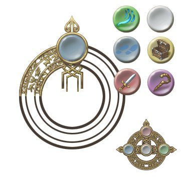
The concept of the ring menu and some buttons in
different styles (realistic icons, abstract icons).
In the lower right you see the menu in it's actual
ingame size.
You see, there's a rough concept for the menu, but I'am already unhappy with it. For that reason, don't take this concept too serious. I'am going for something more like pulldown menus or a combination of both with lesser icons and more text.

interaction bar:
The interaction bar represents the power or time of your interactive magic and skills. As the player increases his skill level during the game, the bar, which is almost empty at the beginning, will be filled further and further and grow longer. This shows, that the player gains more and more power for his interactive magic.
The interaction bar is located at the lower edge of the touchscreen. In the Strategy Screen the bar will only show, if the player uses interactive magic, otherwise it will be invisible. When he draws a line to any object or creature to activate the interactive magic, the bar will deplete, as if it is ink or something like this. Therefore the interactive power is limited in distance depending on the players skill level. The more experienced the player gets, the farther he can influence objects in the Strategy Screen.
In Fight Screen the interaction bar will be visible all the time, but only in attack mode (physical and magical). If the player is in defense, the bar will not show up. The function is quite different, too. The interaction bar works here as a timer. As soon, as the attack (either physical or magical) starts, the bar will start to deplete. When it runs out the attack ends. So the interaction bar represents the time the player has to either attack with a weapon or interact with a magic effect. As the player gains experience and the interaction bar grows longer, the player has more time to attack physical or to improve the damage a magic attack will inflict. He will get stronger.
inventory:
stats screen:
pause menu:
load/save menu:
main menu: